Flutter Dropdown Button Widget

Let’s make a basic dropdown button
Let’s make a flutter application and add a scaffold as the home screen as follows.
import 'package:flutter/material.dart';

void main() => runApp(MaterialApp(
      title: "Tutorial",
      home: Home(),
    ));

class Home extends StatefulWidget {
  @override
  _HomeState createState() => _HomeState();
}

class _HomeState extends State<Home> {
  @override
  Widget build(BuildContext context) {
    return Scaffold(
      appBar: AppBar(
        title: Text("Flutter tutorial"),
      ),
      body: Text(
        "Hi",
      ),
    );
  }
}
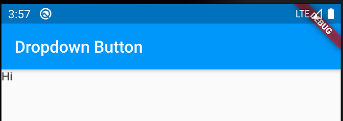
StatefulWidgets are the widgets where we can change the values on the interface at runtime and StatelessWidgets are the widgets where the values of the interface cannot be changed at the run time. For the example the StatefulWidget is used as we have to change the value on the interface. Scaffold is used as a background for this example. Following is the preview of the above code.

Let’s add a basic dropdown button to the screen.
In the following code the DropdownButton is wrapped inside a Container widget to add padding and there are several widgets you can use to add padding to the child DropdownButton widget. In DropdownButton Widget there are many attributes but for now following attributes are being used.
- items This is where the elements of the DropdownButton widget is added as list of DropdownMenuItem widgets which are having a value attribute, child attribute which are using here and some more.
- value This is where the pointer which holds the display value of the DropdownButton widget.
- onChange This is the one of required parameter apart from the items attribute and when user click one of the DropdownMenuItem this will trigger and execute the function assigned.
Following is the basic drop down button example
import 'package:flutter/material.dart';

void main() => runApp(MaterialApp(
      title: "Tutorial",
      home: Home(),
    ));

class Home extends StatefulWidget {
  @override
  _HomeState createState() => _HomeState();
}

class _HomeState extends State<Home> {

  int _value = 1;

  @override
  Widget build(BuildContext context) {
    return Scaffold(
        appBar: AppBar(
          title: Text("Dropdown Button"),
        ),
        body: Container(
          padding: EdgeInsets.all(20.0),
          child: DropdownButton(
              value: _value,
              items: [
                DropdownMenuItem(
                  child: Text("First Item"),
                  value: 1,
                ),
                DropdownMenuItem(
                  child: Text("Second Item"),
                  value: 2,
                ),
                DropdownMenuItem(
                  child: Text("Third Item"),
                  value: 3
                ),
                DropdownMenuItem(
                    child: Text("Fourth Item"),
                    value: 4
                )
              ],
              onChanged: (value) {
                setState(() {
                  _value = value;
                });
              }),
        ));
  }
}
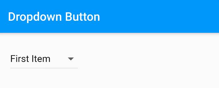
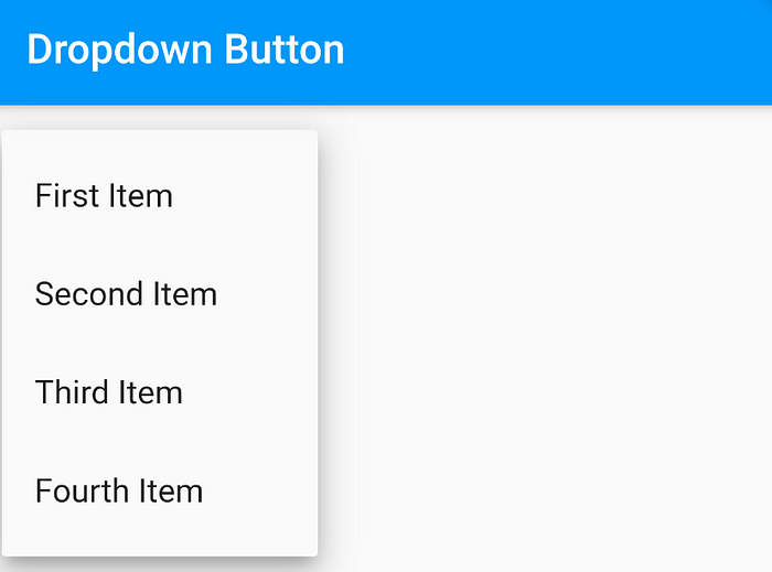
As you see the private variable is assigned as _value to point and store the current state of the DropdownButton widget. The current state of the _value is changed once the user changed the value of the dropdown and then the function at the onChange attribute is triggered. If someone needs to change the current status of the variable at the runtime then setState function should be changed. Once a value changed all the widgets having that value will re-render. Following is the preview of the above code.


Let’s get dropdown elements from a list
Some cases the dropdown items cannot be hardcoded either it is retrieved form an API or as objects. Let’s see how this can be implemented. First lets make a simple class to make listItem objects for the dropdown menu.
class ListItem {
  int value;
  String name;

  ListItem(this.value, this.name);
}
Above class will take value and name as parameters and for the example getter and setters and not implemented since this is for explaining purposes. First the _dropdownItems ItemList is created using ItemList objects and then buildDropDownMenuItems function the DropdownMenuItem list is created. When the widget mount using init function which called at first DropdownButton item list and the value is set using _dropdownMenuItems and _selectedItem variable.
import 'package:flutter/material.dart';

void main() => runApp(MaterialApp(
      title: "Tutorial",
      home: Home(),
    ));

class Home extends StatefulWidget {
  @override
  _HomeState createState() => _HomeState();
}

class _HomeState extends State<Home> {

  List<ListItem> _dropdownItems = [
    ListItem(1, "First Value"),
    ListItem(2, "Second Item"),
    ListItem(3, "Third Item"),
    ListItem(4, "Fourth Item")
  ];

  List<DropdownMenuItem<ListItem>> _dropdownMenuItems;
  ListItem _selectedItem;

  void initState() {
    super.initState();
    _dropdownMenuItems = buildDropDownMenuItems(_dropdownItems);
    _selectedItem = _dropdownMenuItems[0].value;

  }

  List<DropdownMenuItem<ListItem>> buildDropDownMenuItems(List listItems) {
    List<DropdownMenuItem<ListItem>> items = List();
    for (ListItem listItem in listItems) {
      items.add(
        DropdownMenuItem(
          child: Text(listItem.name),
          value: listItem,
        ),
      );
    }
    return items;
  }

  @override
  Widget build(BuildContext context) {
    return Scaffold(
      appBar: AppBar(
        title: Text("Dropdown Button"),
      ),
      body: Container(
        padding: EdgeInsets.all(20.0),
        child: DropdownButton<ListItem>(
            value: _selectedItem,
            items: _dropdownMenuItems,
            onChanged: (value) {
              setState(() {
                _selectedItem = value;
              });
            }),
      ),
    );
  }
}
Let’s Remove the underline of the DropdownButton
The underline at the bottom of the DropdownButton widget can be removed wrapping the DropdownButton widget using DropdownButtonHideUnderline widget

Add some styling for dropdown button
The basic styling for dropdown button can be done using style attribute of the DropdownButton widget and other than that boarders and background colours can be added wrapping the DropdownButton widget using Container widget and then styling the Container widget as follows.

@override
  Widget build(BuildContext context) {
    return Scaffold(
      appBar: AppBar(
        title: Text("Dropdown Button"),
      ),
      body: Padding(
        padding: const EdgeInsets.all(8.0),
        child: Container(
          padding: const EdgeInsets.only(left: 10.0, right: 10.0),
          decoration: BoxDecoration(
              borderRadius: BorderRadius.circular(10.0),
              color: Colors.cyan,
              border: Border.all()),
          child: DropdownButtonHideUnderline(
            child: DropdownButton(
                value: _selectedItem,
                items: _dropdownMenuItems,
                onChanged: (value) {
                  setState(() {
                    _selectedItem = value;
                  });
                }),
          ),
        ),
      ),
    );
  }
Hopefully this is helpful.
If you have found this helpful please hit that 👏 and share it on social media :).
You can find the source code of this application on the following link https://github.com/yashodgayashan/flutter-tutorial/tree/dropdownButton
